
text trial 1 Arial Bold

text trial 2 Britannic Bold

text trial 3 Arial Bold 3D
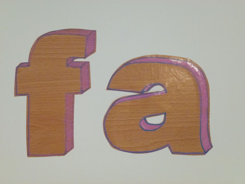
text trial 4 Arial Bold 3D pink
I am making a text wall work for Put Up Your Dukes! Part Two. It is a caption from The Modern Art of Flower Arranging by Elisabeth de Lestrieux, originally published 1982, (published in English 1986 Hamlyn). A rather fantastic book that I found at an op shop which has sat in my studio tempting me with its slightly faded photos and sincere enthusiasm, but has up til now evaded all attempts to be put to work as art. Maybe it is too good already. But still, I am going to try.
The two part Put Up Your Dukes! project uses the dubious construct of ‘nature’ as a foil for contesting our (Gabrielle Amodeo and my) inversely relational practices. I want this work to play to both the reconstruction of nature (wood vinyl and flower arranging) and to undermining the gravitas implicit in a large-scale text work. Gabrielle is making a immaculately drawn text work on paper, in addition to her immaculately made books from Part One of the project, so I want my text work to be large and somewhat crudely made. Which probably means that I have to hand cut it (as best I can, which is crudely). It would be much, much easier to get it vinyl cut, but I suspect that to really work it has to fall blindingly short of digital perfection.
The question is, do I go with the hand-drawn 3D shadow? Is the pink a step too far? Can I buy another pink pen once that one runs out? Is it too try-hard slacker? Or is it trying to be slacker cool but ending up embarrassingly contrived?
The quote has exactly 150 letters – that is a lot of pink-pen and blade knife.

Excellent article! We will be linking to this great content on our website.
Keep up the great writing.
LikeLike